English version in progress.
ABeZeh
ABeZeh is a typeface system focussed on reading. ABeZeh’s distinguished, open and friendly shapes make reading easier – for both adults and children. Readers can clearly differentiate between capital I and lowercase l. The lowercase b, d, p and q are not mirrored, but clearly differentiated and the lowercase a and g come in a single-storey shape.
ABeZeh’s EDU version is free for non-profit educational contexts (for teaching and therapy staff, institutions, pupils, parents, non-profit organisations). Of course, a commercial use is possible and very welcome to all of those who don’t match these criteria.
Tester
Hint: Please rotate the device to landscape mode or switch to a larger device for best testing experience.
ABeZeh: Syllable connector feature
ABeZeh typeface contains syllable connectors. This function was commissioned by Swiss Schulverlag Plus.
In contrast to the other very few typefaces with syllable connectors, ABeZeh offers more possibilities to use the connectors in the appropriate length – after all, each letter combination is different in length.
The input formula for the syllabic connectors looks complicated at first, but with a little practice it can be easily mastered by users.
The replacement works via an OpenType feature style set (ss02) in all ABeZeh weights, except from the Italic styles. So there is no additional syllabic connector font needed!
How it works

Enter the first syllable
→ Syl
Then the length and weight of the syllable connector, divided by *
→ 3*s (stressed)
2nd syllable, followed by length * weight
→ la1.5*u (unstressed)
3rd syllable, followed by length * weight
→ ble2.5*u (unstressed)
= Syl3*s la1.5*u ble2.5*u
Length can be adjusted in 0.5-steps (0.5–9.5)
It is advisable to use the number of letters in the syllable as a starting point and then adjust step by step, if necessary.
Connector weights: bold for stressed (*s), light for unstressed (*u)
Tester
[Opera Browser]
Difficulties while writing syllable connectors might occur. Please test in another browser, i.e. Firefox!
ABeZeh BlueRed
Next to marking syllables by connectors, you can also highlight them by altering colours. You can guess: ABeZeh BlueRed is a colour font and goes for blue and red. For colour recognition issues, there’s also an alternative in light and dark grey. If you need different colours, please contact us.
The colour change of the second syllable is triggered by an underscore (_). If you don’t type an underscore, the whole word will appear blue, which is the default colour. After an underscore, letters will appear red until you type another underscore or a space. For correct functionality, please activate the OpenType feature “contextual alternates” (calt).
How it works

Syllable 1 + _ + syllable 2 + _ + syllable 3 …
Why are punctuation marks not coloured?
Punctuation marks (.:,?!) and other symbols use the colour you assigned to your text, because you might want to highlight them as you wish. Maybe you give them a separate colour, like in this text, or you rather want to assign red or blue manually.
How do I activate contextual alternates?
In Microsoft Word, you’ll find this hidden functionality here:
Format > Font > Advanced > Use contextual alternatives
Tester
ABeZeh Punkt (“Dot”)
ABeZeh Punkt (“ABeZeh Dot”) enables classic tracing exercises. In contrast to the other ABeZeh styles, the shapes of a, b, d, e, g, p, q and y are derived from writing in one go.
Next to ABeZeh Punkt, there is also an alternative with arrows and underlying ruling. That way, it’s very easy to create individual learning material based on editable text.
Tester
ABeZeh Pfeil (“Arrow”)
ABeZeh Pfeil (“ABeZeh Arrow”) supplements ABeZeh Punkt with writing instructions marked by arrows. The stroke entry is marked by a dot-ended arrow, and the arrows are numbered. If the pen is not lifted from the paper, there is no new number, but an arrow indicating the changed writing direction.
ABeZeh Pfeil is also available as a variant for left-handed people. This was developed on the initiative of and in collaboration with Josephine Hendel, a special needs teacher and consultant for left-handed people from Voigtland, Germany. Thank you very much!
Tester
ABeZeh Pfeil LINKS (“Arrow LEFT-HANDED”)
ABeZeh Pfeil LINKS was developed on the initiative of and in collaboration with Josephine Hendel, a special needs teacher and consultant for left-handed people from Voigtland.
She stated that a freer approach to writing direction may support left-handed children’s acquisition of writing. They would intuitively push the pen rather than pull it, which is not intended in Latin script. However, the preparation for the so called Schreibschrift (connected script handwriting) should be kept in mind, too.
For this reason, strokes that are absolutely necessary for the connection to the next letter are indicated in the traditional direction. If it comes to letters with vertical parts (stems) on the left-hand side of the letter (such as h) and circled shapes (such as o), the children can decide for themselves from which direction to start though.
All in all, this approach supports left-handed kids where possible, also when changing to connected script handwriting.
Tester
ABeZeh Linie (“Line”)
With ABeZeh Linie, you can create your own teaching materials with rulings. Combined with ABeZeh Punkt and ABeZeh Pfeil, writing exercises can be designed very easily.
ABeZeh Linie is a colour font. The grey shading of the lines appears automatically. Older environments may not be able to display this technique properly and show a fallback variant with black lines instead.
Why is the x-height area (“the ground floor”) coloured?
This practice is common in textbooks and exercise books. It is intended to gently support the children to stick to the provided heights. This approach also doesn’t restrict the writing process too much and prevents illegibility caused by frequent crossing of the lines. The baseline, on the other hand, is coloured in black to make it easier to stay within the same line.
How it works

Underscore _
Space with ruling
Square brackets [ ]
New line / end of line
Round brackets ( )
New line / end of line with writing houses
Tester
ABeZeh Box
ABeZeh Box makes word silhouettes very easy. Word silhouettes are a common method of augmentative and alternative communication (AAC). On the initiative of Dr. Stefanie Sachse from the FbZ-UK at the University of Cologne, we created a colour font that automatically displays white boxes.
Box silhouettes add another dimension to words by highlighting ascenders and descenders. That way, it is easier to recognise and memorise simple words. You are free to choose the colour of the background/the box.
How it works
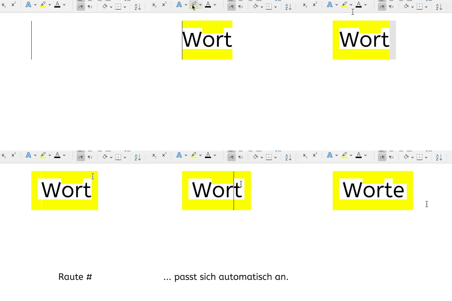
Hastag #
= Additional white space before or after the word – is adapted automatically to the height of letters (contextual variants/alternates have to be switched on).
Underscore _
= Space. Some apps don’t mark spaces. If this is the case, you can also use _
The coloured background in the online tester disappears temporarily during active text input.
Tester
ABeZeh Konfetti (“Confetti”)
Learning is great but have you ever thrown confetti on blank paper? ABeZeh Konfetti is perfectly suitable for invitations, posters and festive occasions – basically everything kids ought to see, read and be excited about!
Tester
ABeZeh Icons (A as in Apple)
A as in apple
B as in beaver
C as in computer, …
This icon font represents the initial letters with child-friendly drawn pictograms. The English and German version are almost the same:
A as in Apfel
B as in Biber
C as in Computer …
But different:
U as in Uhr (EN: umbrella)
Q as in Qualle (EN: queen)
V as in Vogel (EN: Viking)
Comment c’était en Français?
A comme abeille
B comme baleine
C comme castor …
Tester
ABeZeh Hokuspokus (“Hocus-pocus”)
With ABeZeh Hokuspokus you can magically transform texts stories into word-picture stories. The font replaces certain words with pictures via OpenType feature. This currently works for about 1000 words, mostly nouns such as ant, bed, clown, …
ABeZeh Hokuspokus is a playful way of supporting the learning process and comprehension for foreign language acquisition, as well as the handling of the keyboard. Available in German and English.
How it works

Please make sure that the OpenType feature “Contextual Alternates” (calt) is switched on.
In Microsoft Word, you’ll find this hidden functionality here:
Format > Font > Advanced > Use contextual alternatives
Fahne
We are eager to expand the language support and character set of ABeZeh Hokuspokus. If you speak a certain language (e.g. Arabic, Ukrainian, …) and would like to contribute, please get in touch.
Tester
[Chrome/Edge under Windows and Opera browser]
Difficulties of displaying word-picture-substitutions might occur. Please test in another browser, i.e. Firefox!
ABeZeh METACOM
METACOM Symbole (“METACOM symbols”) are widely used within the German field of Alternative and Augmentative Communication (AAC). Annette Kitzinger’s extensive symbol collection simplifies communication in many schools, facilities, institutions and in private homes. ABeZeh is represented as a font in the METACOM editor.
In 2022, ABeZeh and METACOM have teamed up to develop a font with the corresponding METACOM symbols above respective ABeZeh characters.
Different font styles are available and can be easily exchanged depending on the pronunciation of the vowels (long/short): ABeZehMETACOM-A and ABeZehMETACOM-Alternative. There is also a puzzle variant for creating small (mathematical) challenges.
Diphthongs, endings and letter combinations (a_u, e_i, e_n, s_c_h, …) can become one connected sound by entering an underscore _.
How it works

At the moment, ABeZeh METACOM is only available for the German language.
Tester
ABeZeh Slab
A Slab typeface is a Serif typeface with quite stressed and robust serifs, which are the little feet at the end of the strokes. ABeZeh Slab doesn’t take itself very seriously – it has slab serifs in unusual places (i.e. l) and angles (i.e. v, w, y); wiggling its way through the lines.
In short: ABeZeh Slab is an addition to the family that largely abandons ABeZeh’s didactic principles. For this very reason, it perfectly takes on the dynamic part of the layout.
